and Apple (red) device use in the downtown Charleston area.</p>")
If you're passionate about the Android vs. Apple mobile device battle, you may have wondered which is more popular in the Charleston area. Wonder a little less, Android appears far more tweet worthy.
We can thank social media analyzer service Gnip's map mash-up of location data from Twitter users that tweet and share their locations publicly.
Trick is, the data layering of Apple device users over Android obscures a real comparison — but we can get a better idea by analyzing the color density of each separately. For our own un-scinteifc hashing of the data, we captured Android and Apple usage individually for the core of the Tri-county area from West Ahsley in the west to Isle of Palms to James Island and up to Summerville and ran a color analysis.
Android devices were represented in 2.14% of the area pictured and Apple iOS devices in 0.82%.
That means there were 2.6 Android-connected tweets flying for each Apple-sourced posting.
Other interesting observations were in downtown Charleston, Mount Pleasant, and Isle of Palms being more Apple centric, and rural areas using more Android devices.
Check out the maps of each platform below and one composite difference, and you can explore the area over at the full map website.
And I'd be remiss not to point out that this graph only reflects mobile phone users that tweet and share their locations, so it isn't a 100% sample size by any means.
Apple device usage

Android device usage
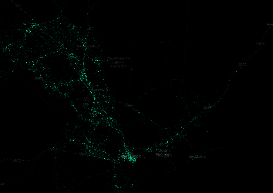
Composite difference