Image by Flickr user Micah A. Ponce
There's no denying that it's been a rather hot spring in the Lowcountry — but it's harder to communicate how much warmer and drier than average.
Well, you're in luck: I like graphs and infographics more than the average Joe, so you're the very lucky reader of a visual explanation of this season's heat.
Here are some graphs from the National Weather Service that do a swell job communicating the difference.
Hotter 'n heck
This graph shows how far outside the norms we are. The blue bars show the range of the high and low for the day while the background green shading shows the average range.
Point: Not since May 20 has the low for the day been anywhere near a normal average.

Rainfall down 44%
And with regards to the rain, the brown area shows just how far down we are from the normal amount of rainfall (and just how little rain has fallen since mid-April).

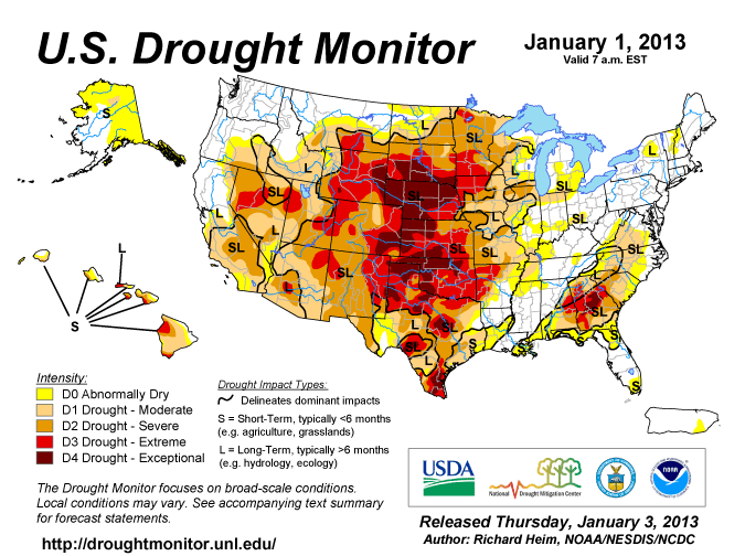
And that's the reason we're in a drought.
And don't forget, the real fun begins when summer hits on June 21.